The Question That Started It All
“Climate change isn’t real,” the student said. I responded with my usual “Scientists tell us there’s a lot of evidence for it”. The student chimed back, “Well you haven’t shown us any. I mean… where are your numbers?”. Oof. In one time-stands-still “Ah-ha” moment, I realized he was right.
I had dutifully told my students about rising carbon dioxide levels, Earth’s increasing temperatures, melting ice, and threats to species. I spoke about fossil fuels and their impact on the atmosphere. We had even discussed the acidification of the oceans. But had I proven anything to them? Nope. I had approached teaching climate change precisely the opposite of what I teach my students to do. I had not supported my claims with evidence.
Data Dig
Now I had a mission: Find. Data. I wanted to find real evidence – something deeper than talking heads on TV or a sensationalist YouTube video. But despite being one of the biggest topics in our society today, it’s actually quite difficult to find cold, hard climate change data. Just about every climate website says “carbon dioxide levels are at their highest point ever”. But what are the exact carbon dioxide levels? Where were the readings taken? Who did the data collection? THAT information takes some rabbit-hole-travels to find.
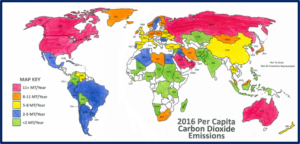
The websites OurWorldinData.org and www.EPA.gov proved fruitful for information on carbon emissions around the world, both by actual tonnes and per capita data. I quickly checked that data off my list.
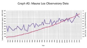
Atmospheric carbon dioxide and temperature data proved much more elusive. NOAA (thankfully) provides this data, but they don’t make it layperson-friendly! This search required a deep dig into ice core data from Antarctica and atmospheric data from Hawaii. With a big mug of coffee, I poured over Excel files and translated unfamiliar abbreviations. I filtered out carbon dioxide levels and temperature readings from other atmospheric data. It took a lot of time and a very unhappy printer, but I was able to tease out some useful numbers.
Planning a Lesson
With the data found and organized, the next step was to create a lesson. However, handing students data without background knowledge would have gone sideways quickly. I’m sure I am preaching to the choir when I say that kids have a hard time with data tables, graphing, and similar skills.
So, I created a quick introductory reading that breaks down where the data is from and what the units mean.
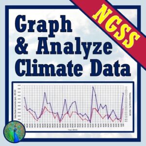
With this background activity complete, kids use the data in two ways. First, they color-code a world map of countries by per capita carbon emissions. This gets them thinking about how modern society is affecting our atmosphere. Second, students graph temperature data and carbon dioxide levels. By plotting them on the same graph, the relationship between the variables is unmistakable.
The value of this lesson is that it gives students two powerful visuals. These aren’t graphics from a textbook or a YouTube video. Rather, they’re visuals the students have created with their own hands. The map of their own creation makes it clear how much carbon is entering the atmosphere. The graph they’ve plotted reveals the close relationship between carbon dioxide and Earth’s temperatures.
I didn’t tell them that carbon emissions are high. They’ve created a map to prove it. I didn’t tell them that carbon dioxide levels and temperatures are related. They’ve generated their own graph to prove it. Time and time again, these activities provide the evidence-based “Ah-ha” moments that are so important. Mission completed. Onto the next!.
If you would like to use some climate change lessons in your classroom, check out the links below.

